The Real Problem: Shared UI, Divergent Icons
When five product teams share a React component library, icons usually break first. One team ships outline actions, another drops in flat color symbols from a slide deck, a third copies a random SVG from a blog post. Components compile, but the interface stops feeling like one product family.
Standardizing iconography in-house works, but it means:
- Art direction and system design
- Hundreds or thousands of icons to draw
- Ongoing maintenance as new features ship
Icons8 Icons hits a useful middle ground: a huge, style-consistent library you can shape around your system without drawing everything from scratch.
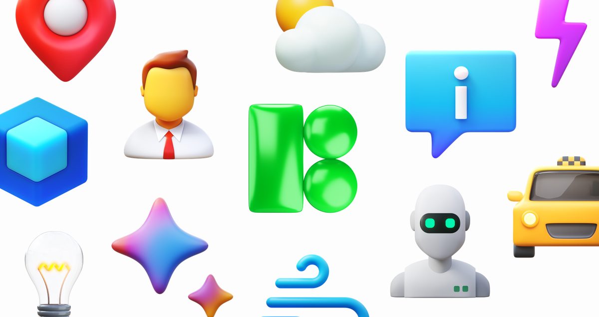
You get more than 1.4 million icons across 45+ visual styles, including platform sets like iOS 17, Material, and Windows 11, plus more expressive looks like 3D Fluency, Liquid Glass, and Emoji. Each style runs deep enough for real product work, with many packs above 10,000 icons.
Scenario: Standardizing A React Library In One Sprint
Picture a Thursday afternoon in a hybrid office. Priya, a frontend lead, just got the mandate: “Unify icons across all five apps this quarter.” Design has a rough direction, no time to draw 800 glyphs.
Her workflow with Icons8 goes like this:
- Pick a primary style, not a single icon.
Using the styles menu, she flips between iOS 17 Outlined, Material Outlined, and Windows 11 Outline for the “navigation” category. Each view shows the same concepts rendered differently. She focuses on coverage and flexibility, not perfect individual icons. A style with 10,000+ icons beats a smaller pack every time.
- Build core sets with Collections.
She creates Collections for:
- Core navigation
- Actions & toolbar
- Status & feedback
- Vertical-specific icons (billing, analytics, content)
From search, she filters by the chosen style, drags icons into the right collection, and organizes them by usage (e.g., nav/home, nav/settings).
- Match the design system palette.
Inside Collections she uses bulk recolor and applies the design system’s primary and neutral tones across entire sets. For monochrome UI icons, that gets very close to spec before anything touches Figma.
- Export as SVG for React.
She exports the collection as individual SVGs. For icons that need fine-tuning, she unchecks the “simplified SVG” option so vector paths stay editable, tweaks them in a vector editor, then imports them into the React library as components.
- Hand over to designers without rework.
Designers pull from the same source using the Figma plugin or the Mac app (Pichon). Mocks and production end up sharing the exact icons and colors.
By the end of the sprint, every shared React component references a canonical SVG from a known collection. Teams stop pasting in ad-hoc assets.
Second Scenario: A New Product With A Different Platform Feel
Six months later, a new product team builds a Windows-first desktop tool. They want to lean into the Windows 11 look without blowing up the shared system.
On a Monday morning:
- The designer browses the Windows 11 Color and Outline styles and settles on Outline for UI, Color for a handful of onboarding and empty states.
- She creates two new Collections:
-
Win11/core-ui-outline-Win11/feature-highlights-color - She bulk-recolors the outlines to the same neutral gray set used across other products so only the accent color feels platform-specific.
- The team exports SVG sprites and PNGs where needed. For internal docs and presentations, they download larger PNGs and PDFs from the same sets so internal materials look like the product.
Because one Icons8 account holds all Collections, the React library maintainers see what’s being used, keep names consistent, and avoid duplicate concepts in clashing visual languages.
Daily Usage Details That Matter
A few features turn Icons8 from “big icon website” into a workable system for multi-team product work:
- Text and image search: Text search with synonyms works well for standard actions, and image search helps when replacing a legacy icon with something in the new style.
- In-browser editor: Quick changes like color tweaks, padding, or adding a stroke happen without opening Figma or Illustrator. Adding a small subicon (like a plus or lock) in the same style saves time on common modifiers.
- Animated icons: For places where you want motion-loading states, success confirmations-Lottie JSON and GIF exports give devs formats that fit into web and mobile stacks.
- CDN links: For internal prototypes or documentation sites, embedding via icon CDN links beats updating asset pipelines.
Teams that standardize on vector usually live on the svg icons page, since SVGs scale cleanly and drop straight into React components.
Comparing Icons8 With Alternatives
In-house icon systems
Rolling your own gives perfect fit and full control. Large organizations with a design systems team and illustration bandwidth often go this route.
Trade-offs compared to Icons8:
- High initial cost: hundreds of icons before you reach parity with a ready-made style pack
- Ongoing work as new concepts appear
- Extra pressure to document rules and police usage
Icons8 trades that control for speed and coverage. You get consistency at the library level, not one-off brand-level uniqueness.
Open source packs: Feather, Heroicons
Feather and Heroicons are clean, popular, and easy to ship. Smaller products or greenfield apps often start there.
Against Icons8:
- Far fewer icons and styles
- Weak support for platform-specific looks like Windows 11 or multiple iOS variants
- Limited animated options
Icons8 carries more weight, but fits better when five teams share one system and need to cover lots of niche concepts.
Other marketplaces: Flaticon, Noun Project
These skew toward marketplace diversity. You get many styles, authored by many designers.
In practice:
- Great for one-off marketing or editorial uses
- Risky for system design because icons from different authors don’t align without rework
Icons8 sits closer to a house style: fewer wild variations, more predictable sets.
Where Icons8 Starts To Feel Like The Wrong Tool
Icons8 isn’t a magic bullet. Real constraints show up quickly:
- Vector access is mostly paid: On the free tier, static PNG tops out at 100px, and SVG is limited to three free categories (Popular, Logos, Characters). For a React component library, a paid plan is realistic if you want broad SVG use.
- Brand-heavy categories need extra care: Logos and some character icons need separate clearance from trademark owners for commercial use. They aren’t “grab and forget”.
- You still share visuals with others: Brands that demand fully unique iconography will always hit the ceiling of a shared library. Icons8 gives customization inside its system, not a blank slate.
- Coverage gaps exist: The icon request feature helps, but each request needs community votes before production. In novel domains, you sometimes settle for “close enough”.
For small apps that only need a couple dozen generic icons, a focused open source pack can feel leaner and easier to manage.
Practical Tips For Frontend Teams Adopting Icons8
From using Icons8 across a multi-team setup, these practices helped:
- Limit styles per product: One main UI style and at most one expressive style (for example, 3D Fluency for marketing screens) keeps things coherent.
- Name icons by semantics, not pictograms: Use
icon/notificationsinstead oficon/bellso you can swap designs later without breaking imports. - Lock colors in Collections: Pick 1–2 icon color tokens from your design system and apply them via bulk recolor. Avoid manual per-icon tweaks.
- Use search-by-image to migrate legacy sets: Drop in existing SVGs or PNGs and pick the closest match in your chosen style to reduce visual drift.
- Keep designers and devs in the same account: Shared Collections cut down on the classic “Figma icon vs production icon” mismatch.
Used this way, Icons8 doesn’t replace thoughtful iconography, but it turns “keep five teams aligned” from an impossible art project into a manageable systems problem.